Full design of the brand identity, packaging and motion-design video campaigns for Cruncholic, a fictional chocolate brand.
During my R506: Digital Creation course, I was tasked with building the digital communications of a brand from scratch. The course brief reads: 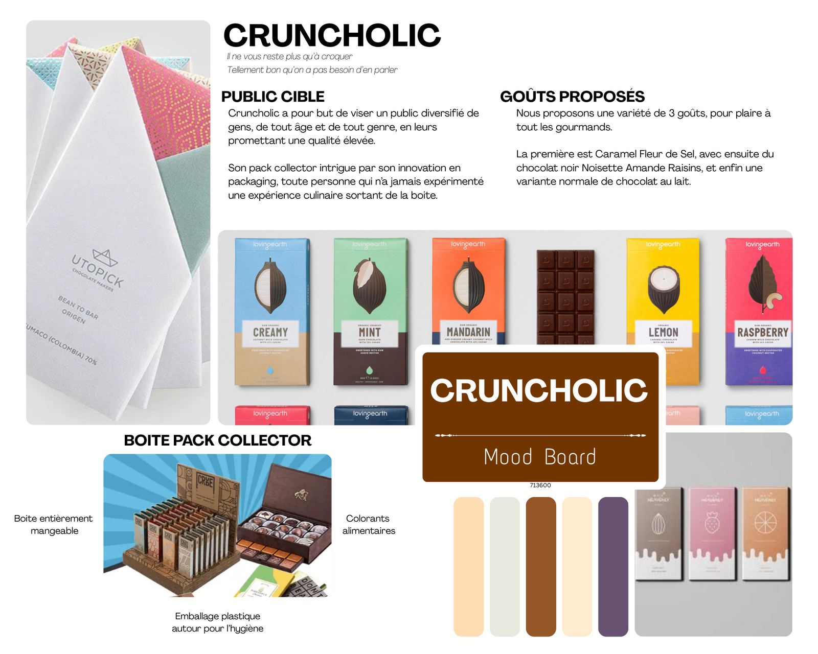


To launch the brand, I produced a high-energy main commercial showcasing the first three bars of the range: Salted Caramel, Milk Chocolate, and Raisin Hazelnut Almond. Fast-paced editing and kinetic typography visually echo the brand's signature 1200°C preparation method.
Express a message through digital media to inform and communicate. Master the entire production chain for graphic creation and multimedia production.
Concept / Ideation
Given carte blanche on the brand, I decided to create CRUNCHOLIC. The first step was to define the message I wanted to convey, and the brand's reason to exist. To do that, I started with a moodboard of various chocolate presentations and packagings.Moodboard
Graphic Design
The next step was creating graphic elements unique to the brand, starting with the logo.Full logo
Second logo version
Third logo version
Packaging
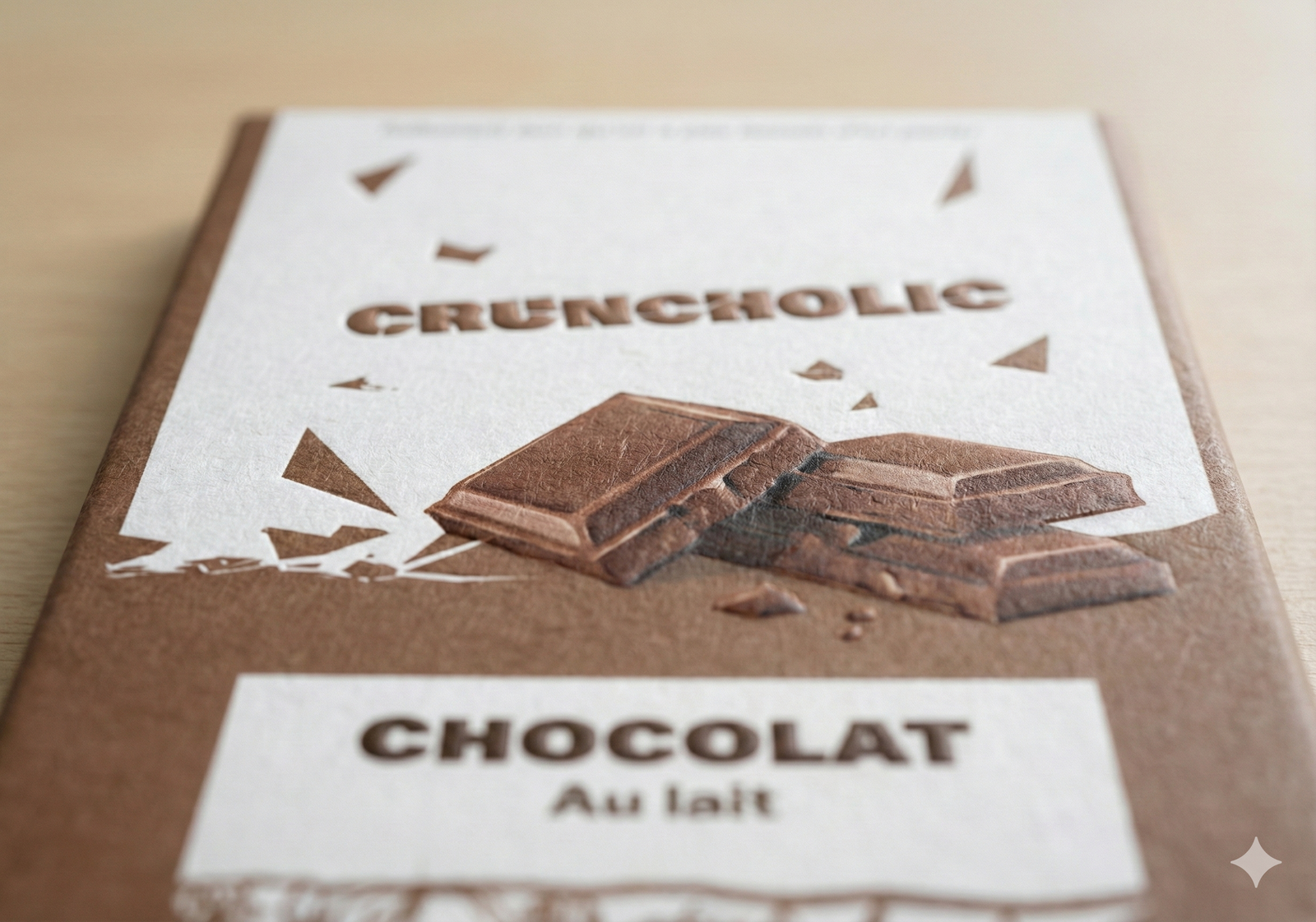
Designing a product's wrapping by combining aesthetic, technical, functional and marketing considerations. The goal is to create a medium that protects the product, catches the consumer's eye and conveys the brand's values. Once the graphic elements and the basic visual identity were locked in, I designed the official packagingDesigning a product's wrapping by combining aesthetic, technical, functional and marketing considerations. The goal is to create a medium that protects the product, catches the consumer's eye and conveys the brand's values. for the brand's different ranges.Caramel Range
Milk Chocolate Range
Raisin Range
Deluxe Box
Brand Guide
A brand guide is a reference document that precisely defines a brand's visual, verbal and graphic identity. It gathers all rules and standards to ensure a consistent and recognisable communication. Producing the brand guide.Brand Launch in Motion Design: Cruncholic
End-of-year Project Motion Design Art Direction After Effects 2025To launch the brand, I produced a high-energy main commercial showcasing the first three bars of the range: Salted Caramel, Milk Chocolate, and Raisin Hazelnut Almond. Fast-paced editing and kinetic typography visually echo the brand's signature 1200°C preparation method.